This exercise was developed in 2009 by Thomas DiMauro, a student in biology and education at the University of Connecticut, and significantly updated and revised by Lauren Stanley, a graduate student in Ecology and Evolutionary Biology, in 2017. It analyzes change in the mean annual temperature in Connecticut in the past 100 years and investigates whether the flowering time of plants may have changed in response. We recommend students work in pairs or small groups, with each group sharing one computer. A PDF version of the exercise is here. More detailed information for teachers is available here.
Introduction
Climate describes the long-term weather patterns in a particular area. We can quantify climate by measuring average temperature, humidity, precipitation, and other variables over many years. Climate change is a persistent departure from these climate averages. For example, scientists could determine that a spring is wetter than usual by gathering data on lake levels, satellite images, and the amount of precipitation, and comparing these measurements to historical averages. If it continues to be wetter than normal over the course of many springs, then it would likely indicate a change in the climate.
The global climate has changed many times throughout Earth’s history, with cycles of cooling and warming caused by factors such as changes in the planet’s orbit, the movement of continents, and volcanic activity. Living organisms have also had a large impact on Earth’s climate. Of particular interest to botanists, the evolution of oxygenic photosynthesis in a cyanobacterial ancestor, the rise (and burial) of large, woody vascular plants, and Arctic blooms of azolla (a freshwater fern with a cyanobacterial symbiont) are all thought to have dramatically affected past climate.
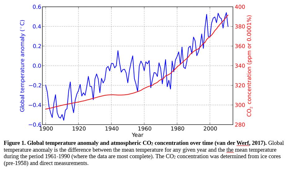
Although we know that Earth’s climate changes naturally over time, we have now entered into a period where the rate of change is extremely high. Within the span of a few hundred years, Earth has experienced ongoing dramatic global temperature rise, ocean warming, glacial retreat, decreased snow cover, sea level rise, declining Arctic sea ice, extreme weather events, and ocean acidification. It is the consensus of the scientific community that these changes are largely due to the activity of humans, particularly the production of CO2 by the burning of fossil fuels (see Figure 1).
How can we determine the impact of climate change on life on Earth? In order to determine how organisms are being affected, we need a historical baseline for their distribution and phenology (key seasonal changes in an organism’s life) to compare to current and future data. One of the most important resources for the study of climate change is biological collections, including herbaria. A herbarium is a library of preserved plant specimens. Each specimen gives unique insight into the time, place, phenology, and conditions of its collection, and is therefore invaluable in the study of climate change.
Today, we are going to investigate Connecticut’s changing climate and the effect that it has on local plants.
After today’s activity, you should . . .
(1) Be able to explain how Connecticut’s climate has changed over the past 100 years, and how you know.
(2) Have a better understanding of/appreciation for biological collections and how they are used to inform and benefit the public.
(3) Understand how climate change is affecting the timing of events in plant development, such as flowering, and why that matters.
Part I: How is Connecticut’s climate changing?
For this exercise, we will be using the NOAA database to determine how and how quickly climate is changing in Connecticut.
1. Go to https://www.ncdc.noaa.gov/cag/time-series/us. Choose the Statewide tab and fill in the following parameters: 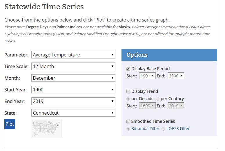
2. Click Plot at the bottom of the page.
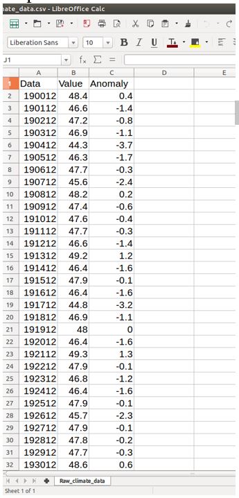
3. Download the data in Excel format by clicking on the Excel icon. The page should reload with the data:

4. Create a folder called “Climate Lab” on the Desktop of your computer. Starting with the “Date, Value, Anomaly” row, select your data and copy it. Paste into a text editor and save the file as “Raw_climate_data.csv” into your Climate Lab folder. ***MAKE SURE TO SAVE IN .CSV FORMAT***
5. Close the file. Open Excel and click File>Open>Raw_climate_data.csv. A window should open which allows you to import .csv files into an Excel spreadsheet. Do not change the defaults in this window, just click OK.
You should now have the data in three separate columns in an Excel sheet:
6. Select and delete the “Anomaly” column.
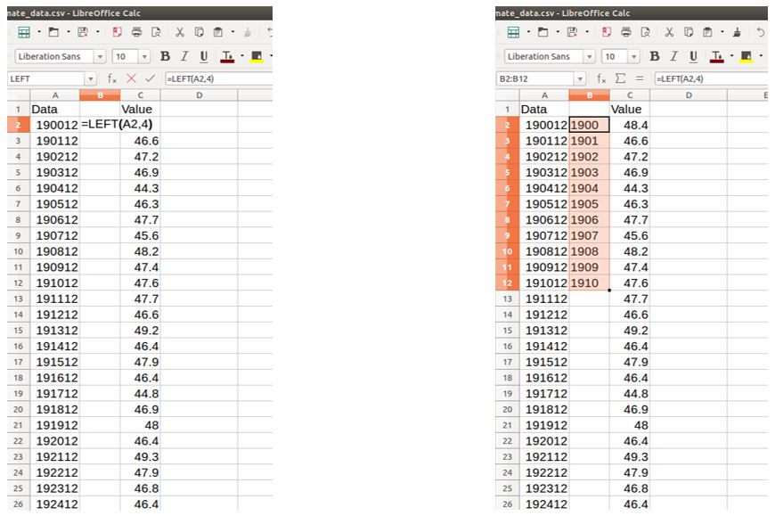
7. Insert a new column between the “Data” and “Value” columns. In Cell B2, type the following formula: =LEFT(A2,4). This will put just the first four digits of the first column into the second column, giving you years in the proper format. Apply the formula to all the cells in the second column by clicking the bottom right corner of Cell B2 and dragging it down.
8. Name your new column “Year” and rename the “Value” column “Mean annual temperature.”
9. Create a new sheet in your spreadsheet. Copy your “Year” and “Mean annual temperature” columns and Paste Special>Values Only into the new sheet.
10. Select your columns and click Insert>Chart>Line graph. Your x-values will come from the “Year” column, and your y-values will come from the “Mean annual temperature” column.
11. Right click on a data point on your graph. In the menu that pops up, select “Add a trendline” (linear). Be sure to tick the boxes “Show equation” and “Show R2 value”.
| The equation of a line is typically written as follows: y = m * x + b m describes the slope (the “steepness”) of the line, telling you how much y changes with every unit of x (and vice versa). R2 is a statistical measurement of how well a trendline fits your data. It ranges from 0 (the trendline is a bad match and cannot explain the variation observed in your data) to 1 (the trendline perfectly matches your data and explains all variation observed). 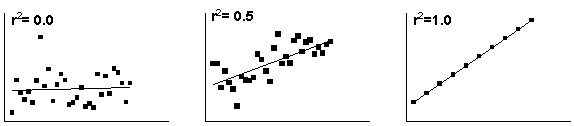 https://www.graphpad.com/guides/prism/7/curve-fitting/r2_ameasureofgoodness_of_fitoflinearregression.htm?toc=0&printWindow https://www.graphpad.com/guides/prism/7/curve-fitting/r2_ameasureofgoodness_of_fitoflinearregression.htm?toc=0&printWindow |
Record the equation of your trendline and value of R2 here:
y = ________________________________________ R2 = ____________
Questions
Is the average temperature in Connecticut changing? If so, is it getting warmer or cooler? How can you tell?
How fast is the mean annual temperature changing? (Hint: think about the slope in your trendline equation).
Is your trendline a good fit for the data? (Consider the R2 value).
Do you think your data would be more or less variable if we looked at all of New England? What about all of the United States? Why?
12. Now, repeat the entire process using a different climate parameter (for example, Precipitation) or changing the time scale (for example, March-June).
Which parameter/time scale did you choose? __________________________________
Record the equation of your trendline and value of R2 here:
y = ________________________________________ R2 = ____________
Compare the graph showing the average annual temperature trends to your new graph.
Questions
Is Connecticut experiencing any change in the parameter/time scale that you chose? How can you tell?
How fast is your variable changing over your time scale? (Hint: think about the slope in your trendline equation).
Is your trendline a good fit for the data? (Consider the R2 value).
Compare your graphs, paying particular attention to the slope and the R2 value. Are they similar or different? Does one have a stronger trend than the other? What does that mean?
Part II: Does climate change affect plant phenology?
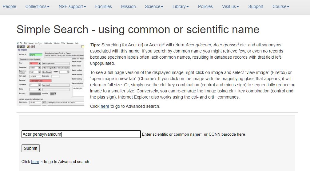
We will be using the Simple Database in the UConn Virtual Herbarium to determine flowering times for CT specimens.
1. Go to: https://search.biodiversity.uconn.edu/SimpleSearch.html
The following species have good data for the desired time period; you will be asked to choose/be assigned one:
| Acer pensylvanicum (striped maple)
Amaranthus cannabinus (salt marsh water hemp) Arabidopsis thaliana (thale cress) Aster lateriflorus (calico aster) Barbarea vulgaris (garden yellowrocket) Bidens laevis (smooth beggartick) Conyza canadensis (Canadian horseweed) |
Draba verna (spring draba)
Erigeron philadelphicus (Philadelphia fleabane) Hesperis matronalis (dame’s rocket) Hieracium aurantiacum (orange hawkweed) Panax trifolius (dwarf ginseng) Silene antirrhina (sleepy silene) Solidago gigantea (giant goldenrod) |
You need to determine when your species began flowering each year for the period 1900-present.
The following is an example of how to use the database to find flowering times for Acer pensylvanicum.
2. Fill in the following fields:
3. Click submit. You will be redirected to a page with collected specimens listed. At the top of the page, click on “Map these results in Berkeley Mapper.” A map with all collections of that species should appear.
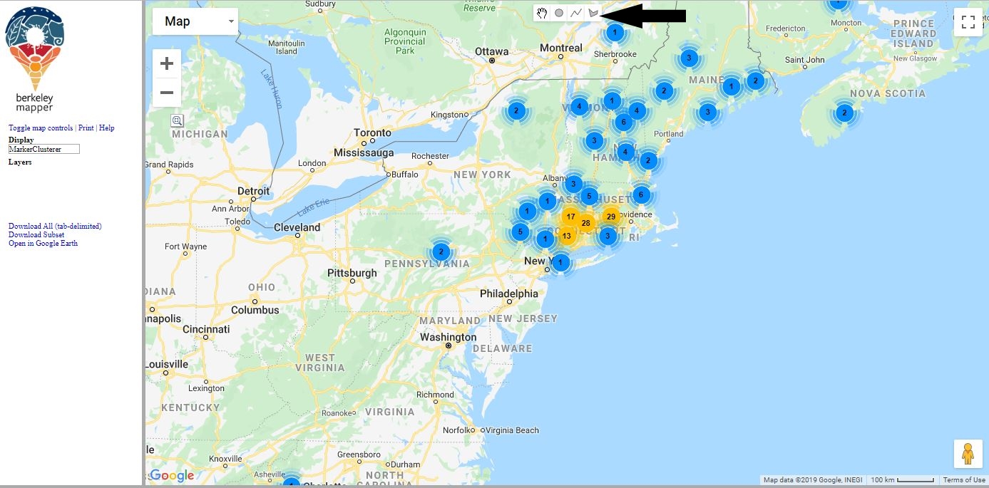
4. Click on the polygon tool (indicated with arrow above) to draw an outline around the points for which we want information for (all of Connecticut).
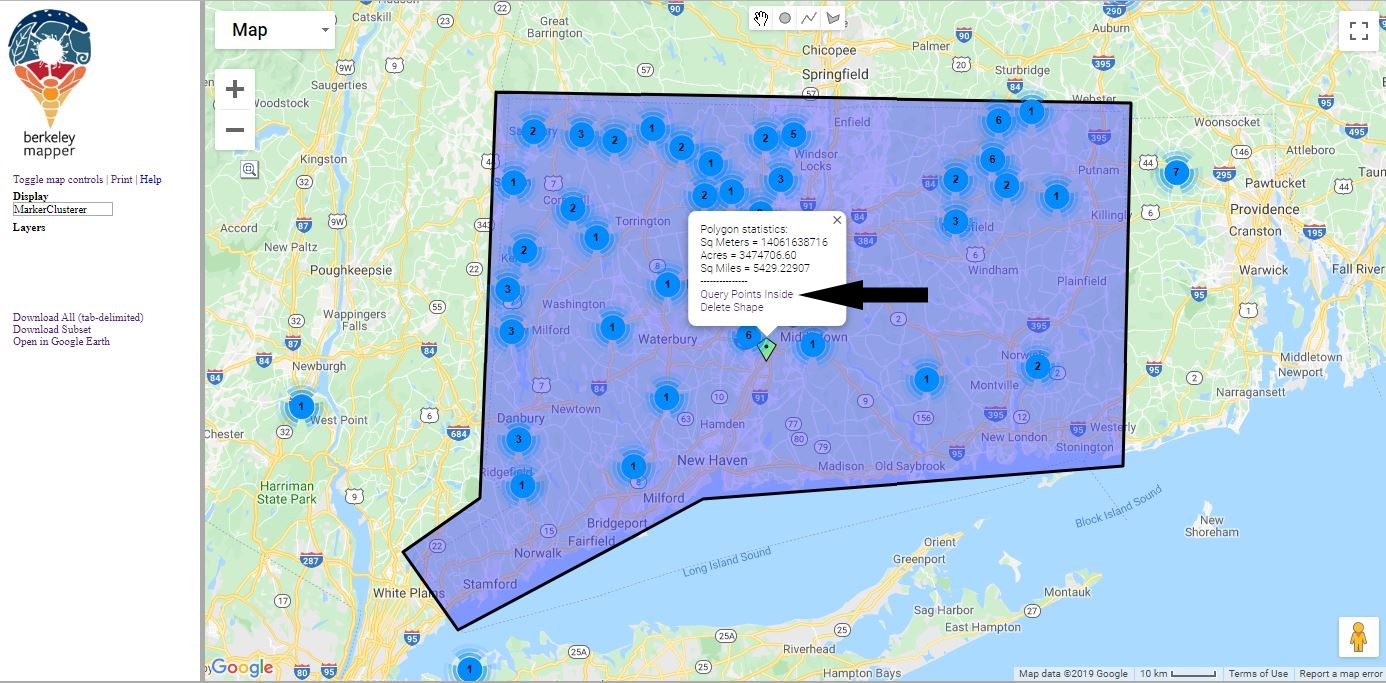
5. In the box that appears, click “Query Points Inside” (indicated above by the arrow). A list of collections should appear at the bottom of the screen.

6. Sort the records by year by clicking on the “Year” tab (indicated above with the arrow). Collections should now appear in order.
7. For every year 1900-present (ignore any collections from the 1800s), click on the “View CONN Record” link (indicated above with a star). A new page should open with information about the specimen.

There are two important fields you should pay attention to, Phenology and Collection Date. Ignore any specimen that was not flowering when collected. If there are multiple flowering specimens for a given year, choose the one that was collected earliest. If there are no results for a given year, it’s not an error—we have no data for that year and you should move on to the next year.
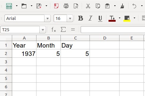
8. Record the flowering specimens in a new sheet in your Excel workbook. There should be one column for the year, one for the month, and one for the date, in that order. Name the sheet your species name.
9. While you are collecting your data, choose one specimen listed as flowering and one listed as fruiting. Click on the camera icon to view the herbarium sheet. Take a screenshot of a flower of your species and a fruit of your species and paste them below.
|
|
10. Now we are going to determine the Julian date when the flowering specimen was collected. The Julian date is the number of days since the year started (i.e. January 1st is 001, December 31st is 365). Make a new column called Julian date in your Excel sheet and paste the following formula into cell D2:
=(B2-1)*30.5+C2. Hit enter.
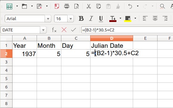
Apply the formula to all the cells in the fourth column by clicking the bottom right corner of Cell D2 and dragging it down.
11. Once you have Julian dates for all the specimens of your species, select the “Year” and “Julian Date” columns and paste them (values only) into a new sheet.
12. Select your “Year” and “Julian date” columns and insert a line graph (don’t connect the points). Your x-values should be the year, and your y-values should be the Julian dates.
13. Add a trendline (linear). Be sure to tick the boxes “Show equation” and “Show R2 value”. Record the equation of your trendline and value of R2 here:
Species: __________________________ y = _______________________________ R2 = _______
Questions
What is the value of the slope in your equation? What does it mean?
Is your plant species flowering around the same day now as it was 100 years ago? If not, is your species now flowering earlier or later?
Describe the relationship between temperature and flowering time in your species (Something like: “In the past 100 years, as average temperatures have . . . flowering time in this species . . .”) Is this the relationship we would expect?
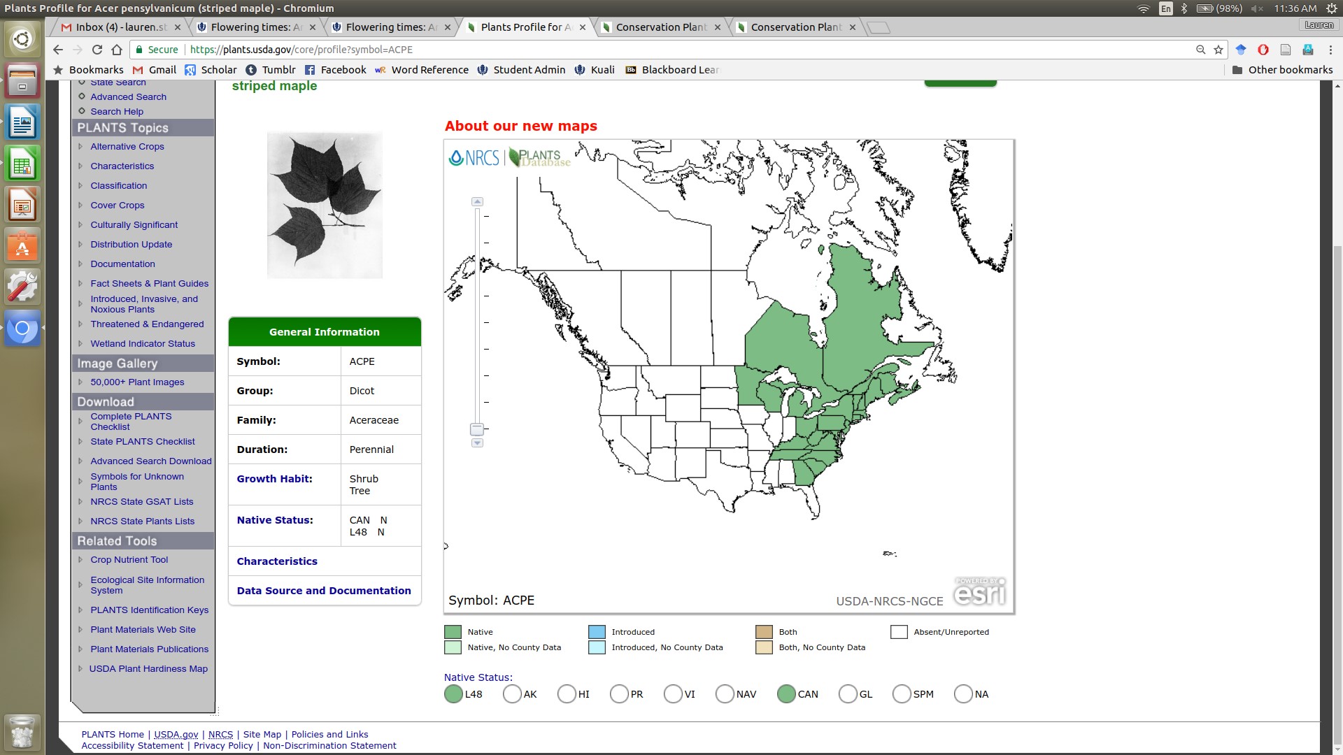
14. To better understand your species and how it may be affected by climate change, we will be using the USDA Plants Database. Go to: https://plants.usda.gov/java/
15. Type your species name into the search bar and click “Go.” You will be redirected to a new page with species information. Under the “General” tab is a wealth of information about your species.
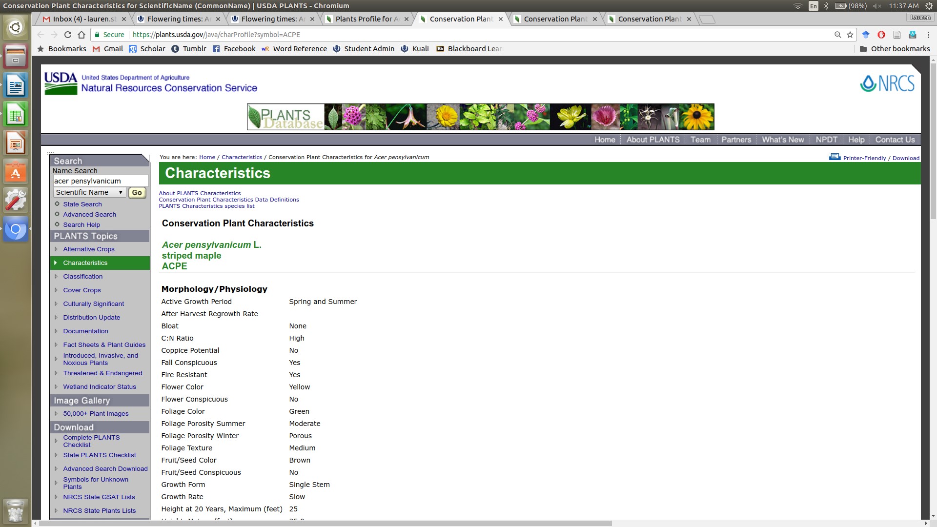
16. Click on the “Characteristics” link to get detailed information on life history, growth requirements, etc.
Questions
Is your species native or introduced? Where is it originally from? How might that affect your plant’s ability to adapt to climate change?
Is your species widespread or confined to a small region of the country? What might that tell us about its ability to tolerate different climate conditions?
Is your species particularly sensitive to any climatic variables (drought, fire, etc.)? Why is that important in the context of climate change?
Use any online resource to determine what pollinates your plant. As climate changes, do you think that the relationship between your plant and its pollinator(s) will stay the same or change?
Now compare your graphs with those your classmates produced for different species.
Did every species respond in the same way to changes in temperature, or were there species whose response was inconsistent? Why might this happen? How might this be important for the plant?
Is there a reason to be concerned if flowers are starting to bloom at different times than they did 100 years ago? Why should we care? Think about animals that rely on plants and their flowers.
Rising temperatures are only one component of global climate change. Other changes include alteration of rainfall patterns – more rain in some places, less in some and changes in when the rain comes in still others – rising levels of carbon dioxide in the atmosphere, and atmospheric deposition of nitrogen, which is an element that plants need. How might we look for evidence of changes in these conditions in Connecticut?
How might changes in these other conditions affect plants? How would we look for evidence that changes in other conditions are affecting plants?